Coaching Program Carousel Design
Problem
Thread Brotherhood, a group coaching program for men of color, needed a strong social media presence to promote its launch. The challenge was to design content that communicated the program clearly while staying true to the brand’s tone, mood, and values.
Idea
I developed a 5 slide Instagram carousel using the provided copy and brand board as a foundation. The design emphasized clarity, emotional resonance, and storytelling, with each slide intentionally guiding the viewer through while maintaining visual cohesion and brand alignment.
Result
The final carousel presented the program with impact and consistency. It provided a visually engaging, on brand promotional piece that elevated the launch announcement and effectively connected with the intended audience on social media.
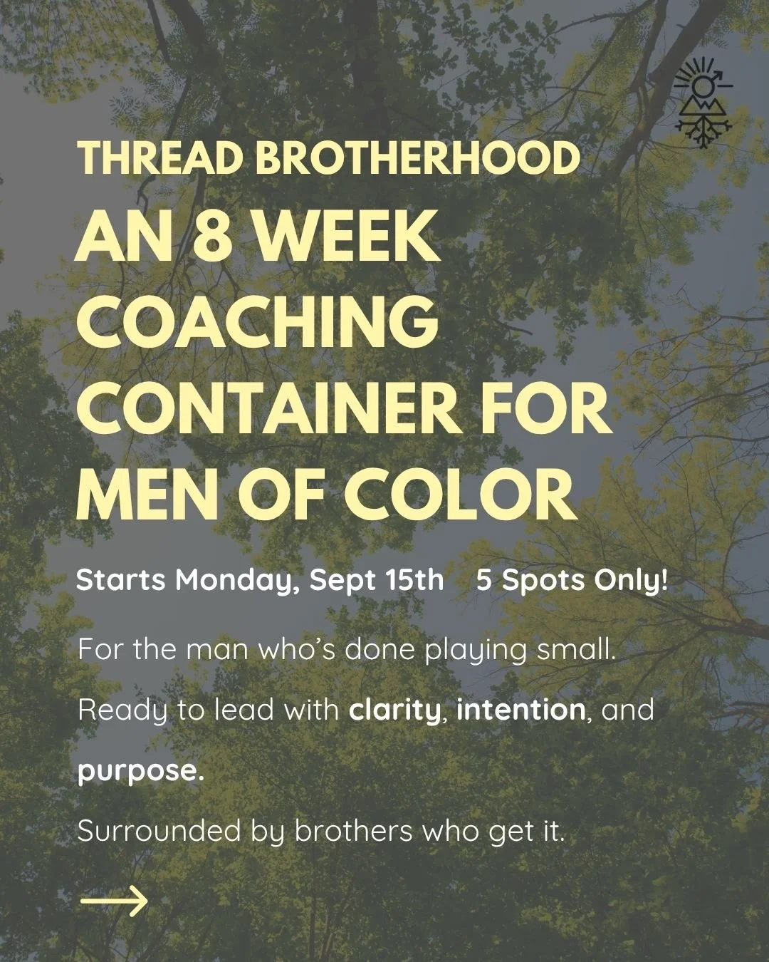

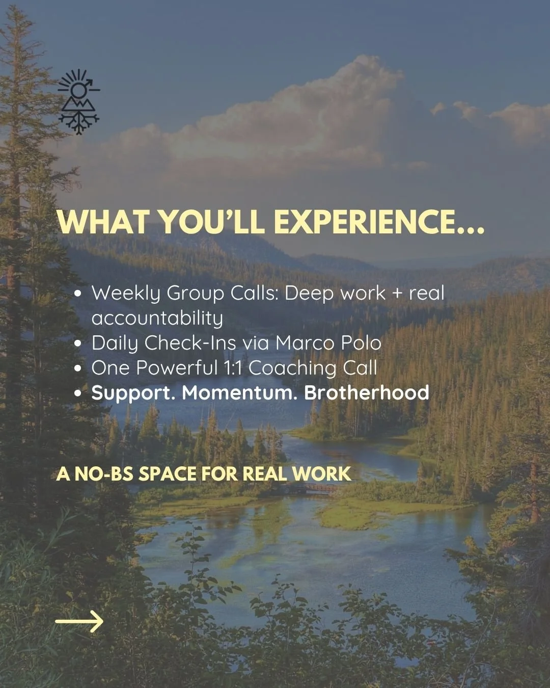


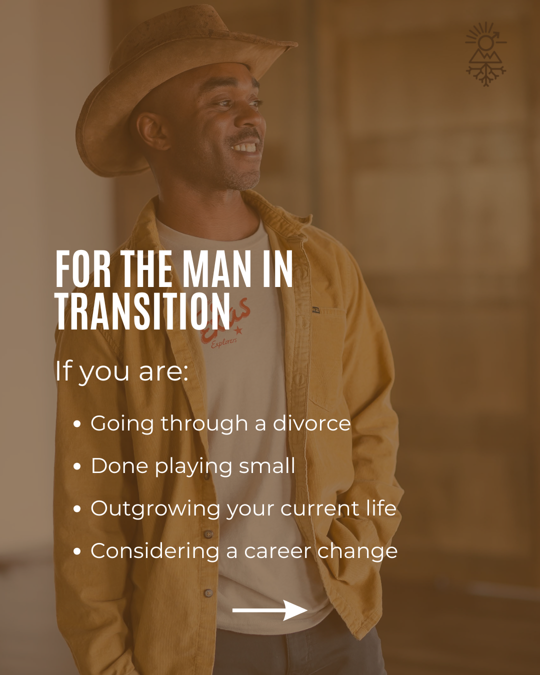
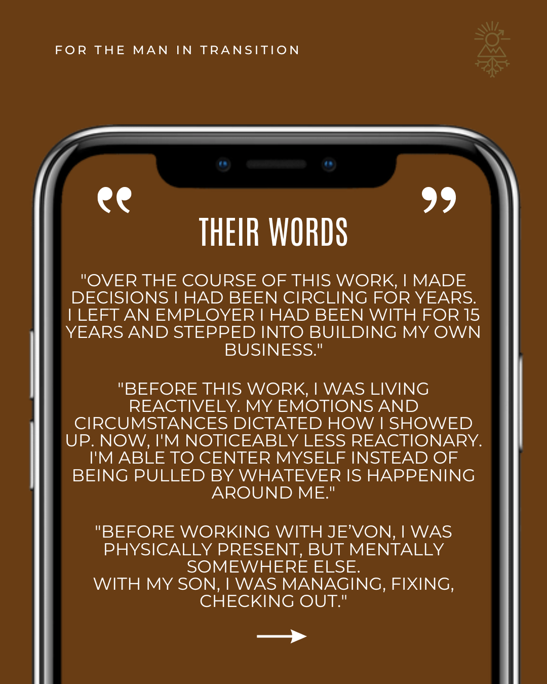
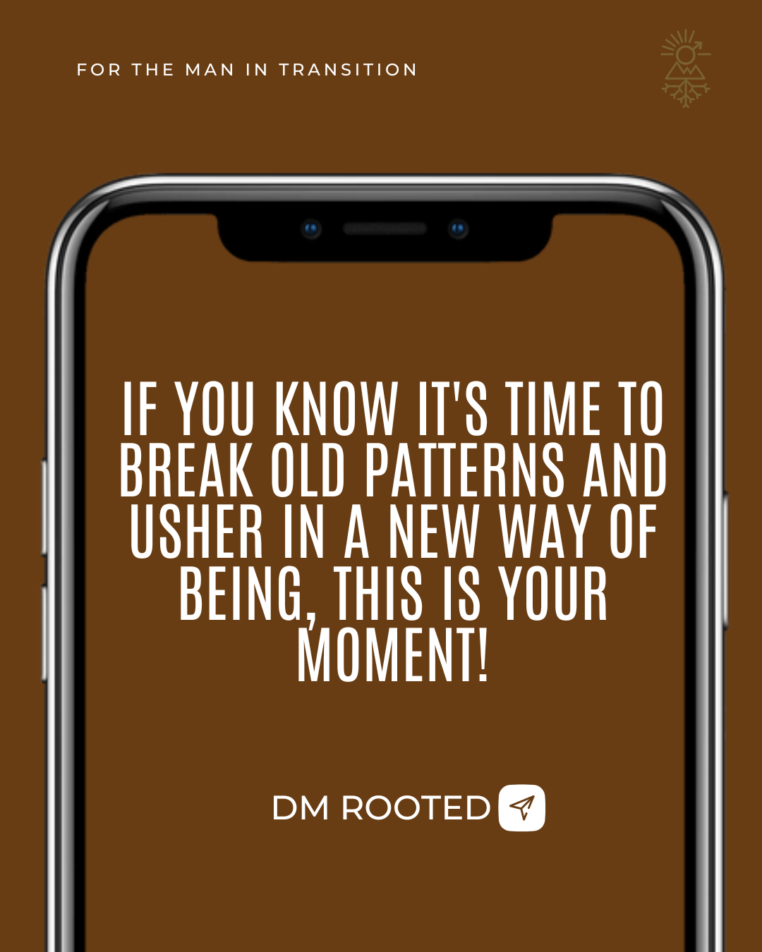
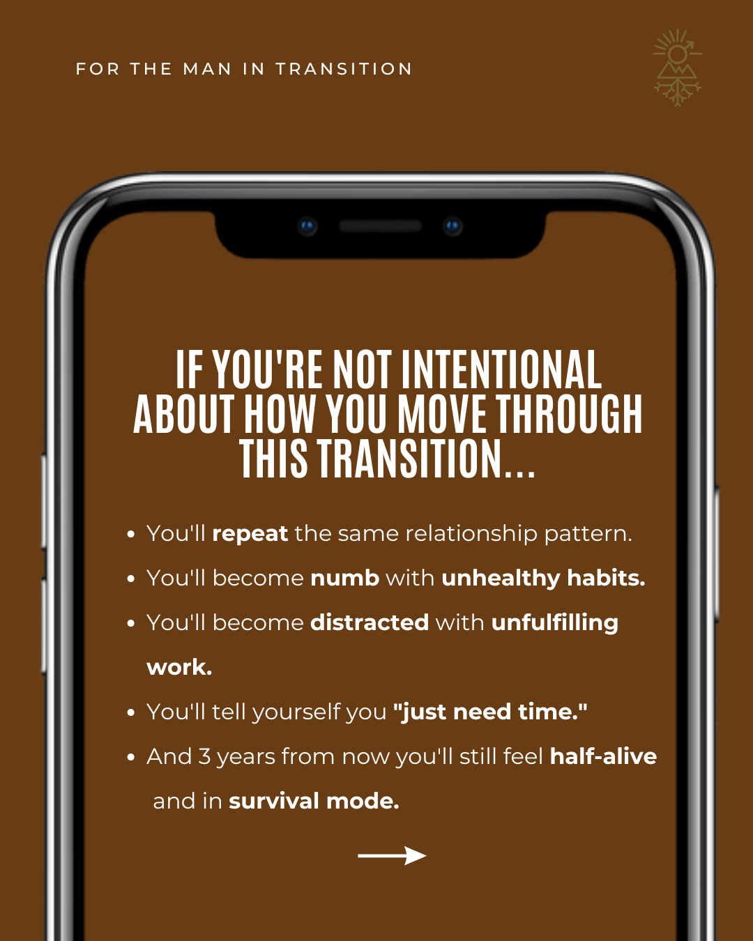
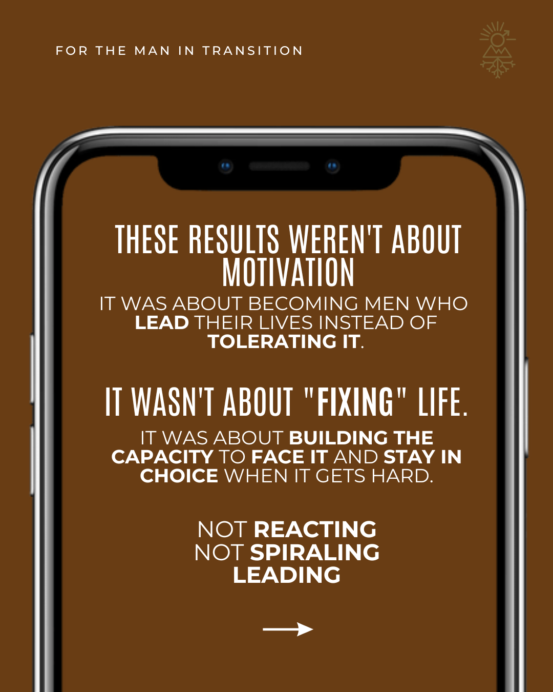
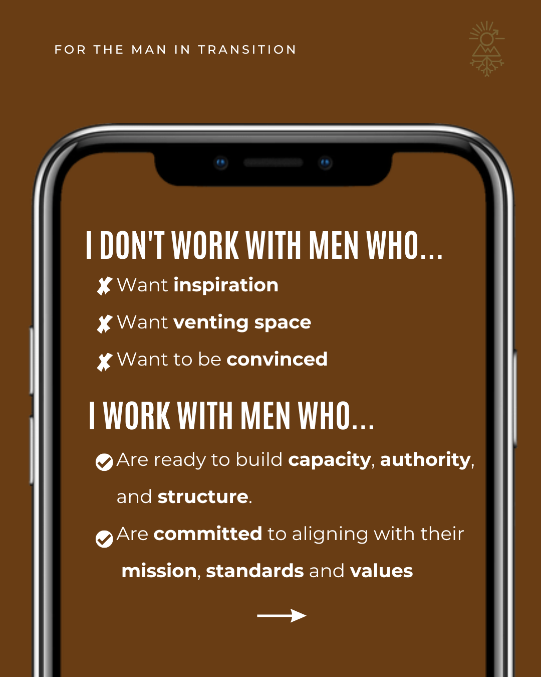
Mens Program event Carousel
Problem
Thread Brotherhood needed a launch-ready Instagram carousel that communicated its value through strong visual hierarchy and narrative UX. The challenge was to design an emotionally resonant, brand-aligned asset that guided users through a clear content journey.
Idea
Designed a six-slide, story driven carousel using intentional pacing and typographic hierarchy. The hero frame established immediate engagement, while subsequent slides introduced controlled tension and solution positioning. Warm earth tones, grid based layouts, and strategic contrast reinforced brand cohesion and readability.
Result
Delivered a high impact promotional asset with cohesive UX flow and design precision, positioning Thread Brotherhood as an authoritative solution for men navigating life transitions.
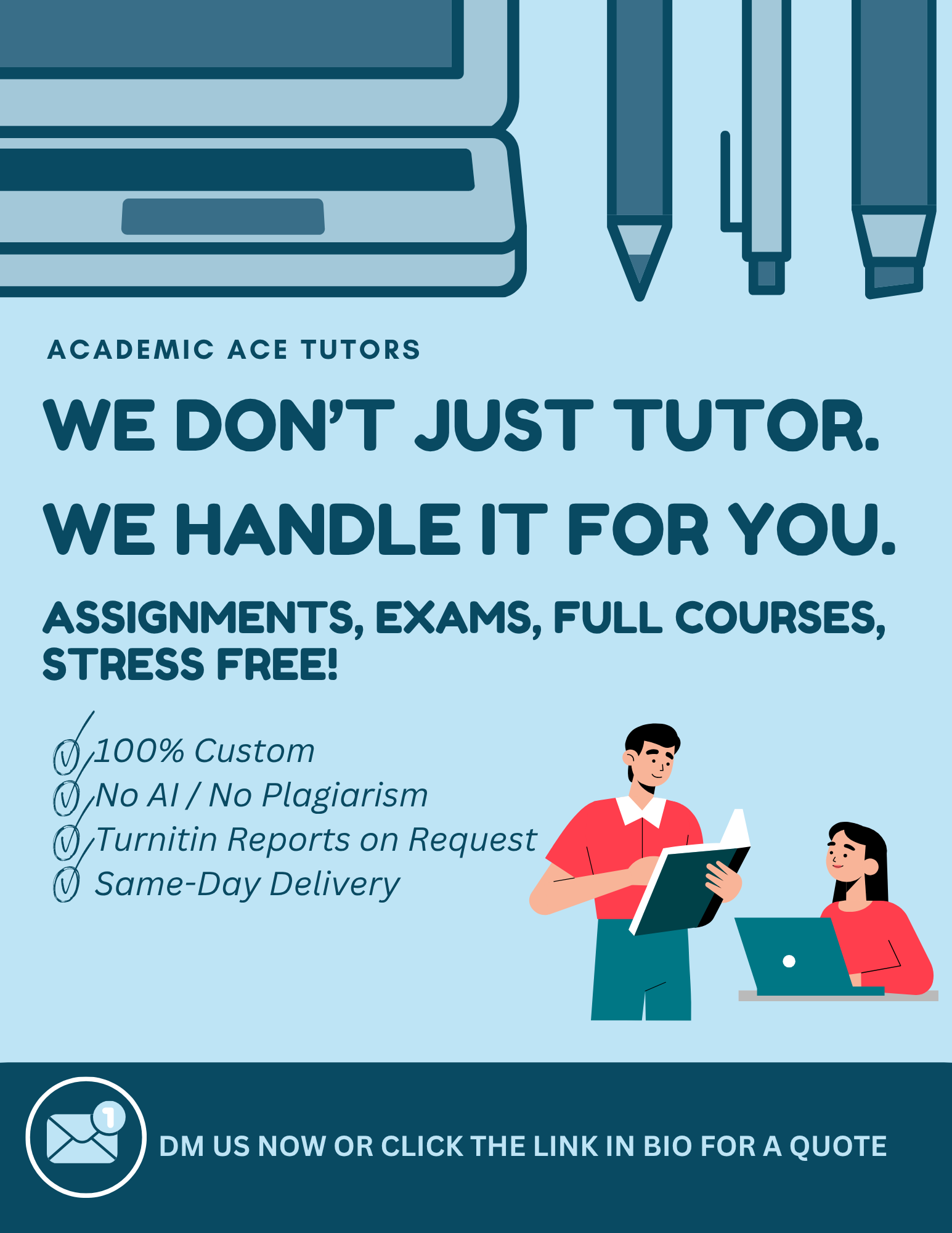
Social Media Flyer
Problem
Academic Ace Tutors needed a social media flyer to promote their tutoring services in a way that was professional, trustworthy, and consistent with their existing brand identity. The challenge was to highlight their unique offerings while keeping the design aligned with their established Instagram style.
Idea
I designed the flyer in Canva using their brand colors, fonts, and layout guidelines. The clean, bold design emphasized their core services custom work, no AI or plagiarism, and same-day delivery while incorporating clear messaging and a strong call to action. The layout balanced professionalism with approachability to resonate with their audience.
Result
The finished flyer delivered a cohesive, on-brand promotional asset that fit seamlessly into their Instagram feed. It effectively showcased their key services, reinforced credibility, and provided an engaging piece of content to attract and convert potential clients.