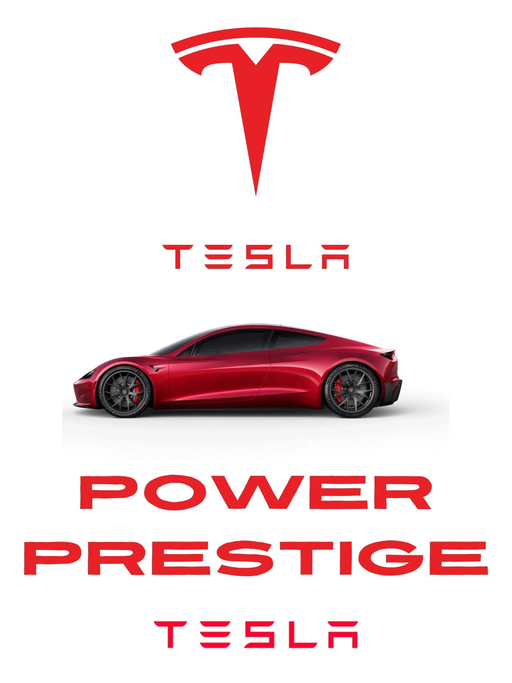
Problem: I realized that many car ads pack in too much information, which ends up distracting from the vehicle. Instead of making the car stand out, the clutter often buries it. I wanted to create an ad that did the opposite one that instantly pulled the eye to Tesla.
Idea: My solution was to design with restraint. I used negative space to frame the bold red Tesla and its matching logo, letting those elements command attention. By focusing on contrast and simplicity, I created a layout that was clear, modern, and free of unnecessary distractions.
Result: The finished ad feels easy to take in at a glance. The minimal approach not only emphasizes Tesla’s innovation and identity but also leaves a lasting impression by being both visually striking and memorable.
“Driven by Design” AD
“Burst of Freshness” AD
Problem: Many food ads feel generic and fail to trigger a real craving for the product. I wanted to design an ad that didn’t just show an orange, but made people actually want one the moment they saw it.
Idea: I used negative space, bold typography, and vibrant imagery to make both the words and the orange itself pop. The bright color palette and spacious layout worked together to create a fresh, energetic feel that taps into the viewer’s senses and appetite.
Result: The final design is clean, striking, and appetite-inducing. The ad not only draws immediate attention but also leaves the viewer with the irresistible urge to reach for a juicy orange.


Logo design
Problem: I wanted to create a personal logo that felt professional and recognizable without being overly complicated. Many logos lose impact when they try to do too much.
Idea: I focused on simplicity, using bold typography and negative space to shape my initials into a clean, modern mark. The black and white palette reinforces clarity and makes the design versatile across different uses.
Result: The final logo is strong, minimal, and memorable. It reflects my style while remaining flexible enough to adapt to different platforms and branding needs.